Wednesday, December 5, 2012
super maybe final Dethklok image
Tuesday, December 4, 2012
Metal Shirt
I decided on a whim to make a band t-shirt for the Dethklok concert coming up that I'll be going to this weekend. I figured "hey, t-shirts are $25 at concerts, and half the time they're kind of ugly, so I'll make one for super cheap and it'll be awesome!" I spent $8 total for two black t-shirts for my boyfriend and myself, already had the shirt transfer paper lying around the house. I looked at the Dethklok skull that's in the show and went off of that kind of design but obviously went off my own design and perspective. It's all pen on paper and I scanned it in and did some fancy Photoshop stuff and played around with the linework until I liked it and finally added the awesome metal font and tada! cheap band shirts that are probably better than the actual shirts at the concert.
Thursday, November 29, 2012
A sketch a day...
Sketches I did over the past couple of days for my "sketch a day" determination project. The first one I did while listening to Wolfmother, who I've been obsessed with for the last few weeks...they're just...AWESOME. The second one was just an idea going off of the feather and skull motif that are in my earlier sketches.
Tuesday, November 27, 2012
buy prints!
http://society6.com/AmandaTodd
This is my account on Society6.com. I am currently selling one print, "Dirty Fingers" and will add more when I can get some more high quality scans of my work.
This is my account on Society6.com. I am currently selling one print, "Dirty Fingers" and will add more when I can get some more high quality scans of my work.
Sunday, November 25, 2012
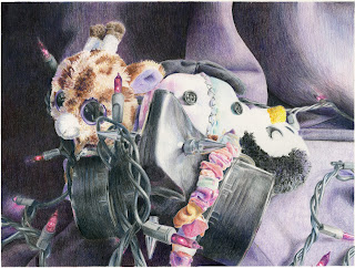
Those dead eyes
This is a colored pencil drawing I did of a still life I set up. Total, this took around 30 hours of work to complete and used up 2 black, 1 dark blue, 2 violet, and 1 tuscan red Prismacolor colored pencils completely, which gave my hands massive cramps.
Oh, Santa...
Here is a recipe I did for Buckeyes, chocolate covered peanut butter balls that my grandma makes. I decided to make it seasonal 1. because of the time of year right now and 2. I might give these out as Christmas cards or gifts.
Art Nouveau robot
Sketching ideas
Here are some sketches I did of an idea I've had recently for a series of ink paintings on wood, mostly inspired by the art of Sam Weber and Marco Mazzoni.
Cadence
This is a watercolor and ink painting I did of my cousin's PTSD dog, Cadence. I have to admit, short fur is very hard to capture in brush strokes.
Counting on Zetalon
These are three page spreads for a 10 counting book for children that I designed, painted, wrote, and put together in 10 weeks. I've sold 10 copies so far and I'm getting more printed to sell in the future.
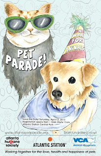
Pet Parade poster
This is a poster design I did for the annual Pet Parade put on by the Humane Society. I designed and painted this poster in less than 20 hours which was a ridiculous task, and I my design didn't get picked, but I'm still glad I participated in the 24 hour event.
Saturday, November 3, 2012
Watercolor and Ink on paper
Watercolor and ink on hot press watercolor paper. I like to do a lot of things involving the relationship, or struggle, between the organic and synthetic. I know this isn't a new concept, but I think that, nor more than ever, it applies to our everyday lives. Natures struggles to survive among the cold pipes of what man creates, and we have to wonder which one is really in control sometimes...
Acrylic ink on wood
Acrylic Ink and gesso on wood panel. It's the first time I ever tried painting on wood, and I really love it! The texture and bleeding was kind of hard to work with, and I had to keep that in mind when working with transparency and the direction of the brush strokes and lines, but overall I'm really pleased with how it turned out, and I might do more and make it into a series.
Monday, October 29, 2012
Sunday, July 1, 2012
Sven
Watercolor and Ink painting I did of Sven from DotA 2. Sven character ©Valve and DotA, design and painting © me
Wednesday, June 13, 2012
Thursday, May 31, 2012
Friday, May 18, 2012
Rough Sketch
This is a rough drawing from my reference picture for a piece I'm doing on violence in Syria. The main challenge will be to make her look like an Arabic child since she actually has very fair skin and blonde hair.
Watercolor Portraiture
This is a watercolor portrait I recently finished of Sean Connery as James Bond. Done in watercolor with a little white gouche in areas.
Digital Illustration
This piece Leo Zodiac piece combines traditional and digital media to imitate the the graphic style and technique of the Balbusso Twins. There are nearly 200 Photoshop layers in this piece. Every stroke was done made with black gouche using a dry-brush technique and then scanning it in and separating the strokes onto individual layers for transforming and coloring.
Monday, April 30, 2012
Hansel unt Gretel ja!
Here is the Hansel and Gretel watercolor illustration in it's almost final form. Critique is tomorrow, so I'll see what tweaks I should make to finish it off. Otherwise, I'm super happy with how awesome it came out!
Saturday, April 28, 2012
More drawings!
Here are some more figure drawings from 2011, the lats one being a metaphorical self portrait done in black and white charcoal and black ink.
Figure Drawings
Some older figure and facial studies I did last year in my Life Drawing class. All done in black and white charcoal, the first with red conte crayon.
Friday, April 27, 2012
Daww robot
Here's a watercolor bookmark piece I did for a project Winter quarter, 2012. The text is computer generated and it has a few levels and brightness/contrast adjustments, but everything is essentially traditional media with watercolor and ink.
CTHULUUU!!
Here are some oldies! Preliminary drawing and color comp done in Photoshop for my Materials and Techniques class I took in Fall 2011. It is a female Cthulu in a stormy sea setting, ominously looking towards a city in the distance.
Midtown Diner menu!
Hi all! Here are two different versions of a retro diner menu for my Electronic Illustration class. 98% of it was done in Illustrator, and the glow around the text and the old-ish effects in the second version were done in Photoshop. I prefer the clean version personally, but I was playing around with old paper textures to make it look extra authentic retro...or something.
Thursday, April 26, 2012
New Art and stuff!
Here's a piece I'm working on illustration the children's fairy tale Hansel and Gretel. it's about halfway finished right now. Everything is in watercolor on stretched watercolor 140lb cold press paper.
Subscribe to:
Comments (Atom)


